AI Driven Design (and Pitfalls) with Claude Design.
A friend asked for help turning a vague corp-dev idea into something concrete. Two hours later we had sixteen structurally coherent prototypes — and a growing suspicion that most of them only looked right at first glance.
Sixteen interfaces. Two hours. One uncomfortable question.
This is not a product review. It is an investigation into what happens when you hand a vague, real-world product idea to an AI design tool — and then ask a trained designer to tell you which of the results are actually good designs, and which ones are just wearing the right aesthetic clothes.
Chapter 01
The spark
It started, as many things do, with a late-night message. A friend who works in corporate development pinged me with an idea: a tool to replace the patchwork of Excel sheets, email threads, and Bloomberg tabs that make up his daily M&A workflow. He wanted something that could hold a strategic thesis, track acquisition targets underneath it, and surface signals — news, earnings, analyst reports — without requiring him to go find them.
What the tool must produce — daily
Vague, but concrete enough to start. Two hours later we had sixteen visually coherent prototypes — legible enough to hold a real design conversation. Which is when things got interesting, because the conversation revealed how many of them were wearing the right clothes without understanding the job.
Co-written with Claudiu Hutanu (LinkedIn), a product designer who provides critique on how to use AI driven design tools effectively to generate quality outputs.
Chapter 02
Why speed changes everything
If you’ve ever hired a designer and waited three weeks for a first-look deck, this process breaks the equation. Not because it replaces the designer — it doesn’t — but because it collapses the time between “I have a vague idea” and “I can have a real conversation about it” to a single afternoon.
That compression is the actual story here. Sixteen directions in two hours sounds like a productivity gain. It is also sixteen opportunities to mistake visual plausibility for operational validity — before anyone has asked the hard questions. Speed produces more decisions, faster. It doesn’t make the decisions better.
We rejected three directions before the designer even saw them — not for visual reasons, they looked fine — but because the interaction model was identical to another direction and the visual register was internally contradictory. That judgment took a human. The brief was excellent. The output still needed someone to read it critically.
/grill-me to close the briefThe most useful thing we found wasn’t what the AI did well. It was learning to see the gap between visual credibility and operational validity — and understanding how easily one masquerades as the other.
Chapter 03
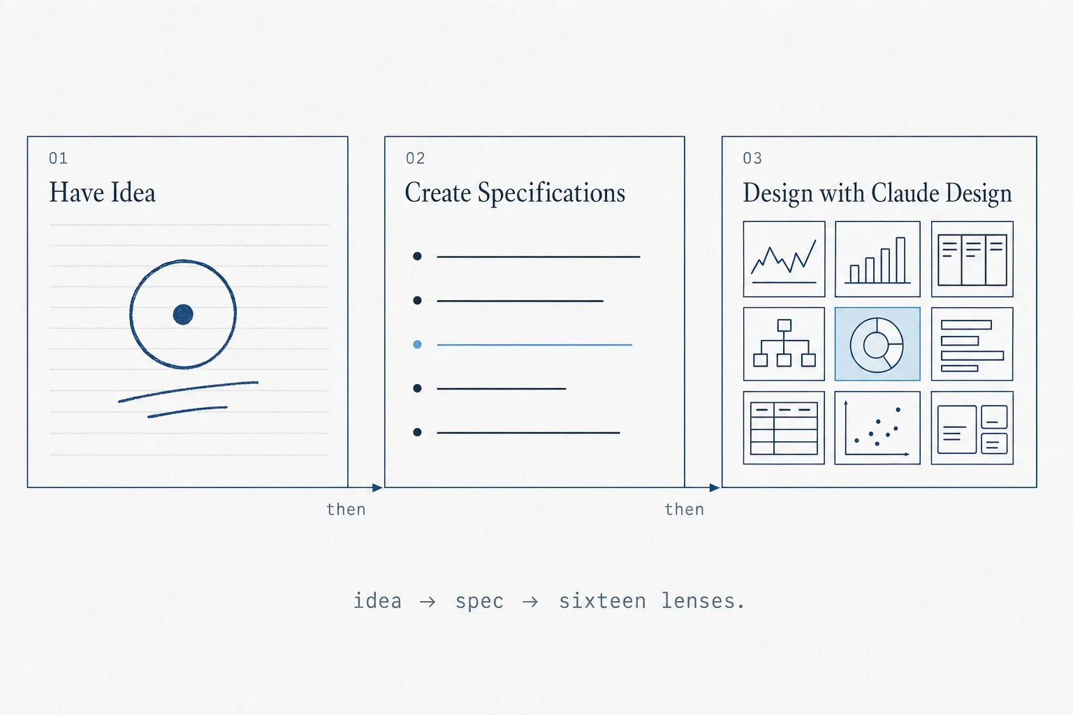
How we ran it
The process had three distinct phases, and the sequence mattered. You can’t skip to generation — the quality of your output is entirely determined by the quality of your brief. Here’s exactly how those two hours unfolded.
/grill-me — the non-negotiable stepThe prompt
My friend said he wanted to make something. Three sentences describing the primary screen. Vague, but enough to start a design sprint.
I asked for three sentences that let a stranger picture the screen. Good enough to grill.
/grill-me — the key step
/grill-me is a Claude Code skill that interviews you one question at a time until every open branch is closed. Nine rounds in, the spec was a structured document: audience, tasks, three mandatory screens, data model, what the design must not do.
The skill does not write your spec. It refuses to let you start the next step until the open questions are closed. Most of the quality achieved in the final deliverables traces back here.
The reference library
The reference library is not a moodboard. It is a constraint document. Each aesthetic anchor defines two things: what you are borrowing (structural vocabulary, type scale, color logic) and — critically — what you are not borrowing. “Inspired by Bloomberg” without that second clause produces directions that inherit Bloomberg’s visual weight without the operational depth that earns it.
To generate distinct and unique designs, we prompted Claude Design to work within four registers, one per aesthetic territory:
- Institutional / data-dense – Bloomberg-style finance-terminal density
- Modern SaaS (Linear, Notion, Pitch, Height) – keyboard-first restraint
- Hybrid (Stripe Dashboard, Vercel, Modern Treasury, Causal) – rigorous data with type discipline
- Canvas-specific (Foundry, Kumu, Obsidian graph, tldraw) – for the interaction model
| Register | Description | References |
|---|---|---|
| Institutional | Finance-terminal density. Serious, dense, monospace-driven. | Bloomberg Terminal, Palantir Foundry, Koyfin, Capital IQ |
| Modern SaaS | Keyboard-first restraint. Clean type, command-palette culture. | Linear, Notion, Pitch, Height |
| Hybrid | Institutional data with SaaS type discipline. | Stripe Dashboard, Vercel, Modern Treasury, Causal |
| Canvas | Interaction model orthogonal to register — applies across all three. | Palantir Object Explorer, Kumu.io, Obsidian graph, tldraw |
The design references
Every direction declares one register, picks at most two references, and spells out in plain terms what it takes from each reference. That is what keeps sixteen directions from collapsing into one.
One additional input: awesome-design.md as methodology, not moodboard. If your company or brand already has a style guide or brand reference, you should use that. Since we had neither, we defaulted to awesome-design.md for some inspiration which greatly sped up our design process.
For reference, DESIGN.md is a new concept introduced by Google Stitch. It is a plain-text design system document that AI agents read to generate consistent UI. Awesome-design.md is a public repository which houses a curated collection of design system documents extracted from very famous and widely used public websites.
We also established a shared fictional company — Acme Mobility Corp, a $40B industrial conglomerate — and held it constant across all sixteen directions. If each direction gets different content, you can’t tell whether one prototype works because the design is better or because the story is easier. Holding the company constant isolates design as the variable.
One caveat with our approach, which we were aware of and acknowledged up front, is that quality decays toward the back. Designs twelve through sixteen are noticeably weaker. That is fine. The point of generating sixteen distinct designs is to see the shape of the space, not to ship the median.
Chapter 04
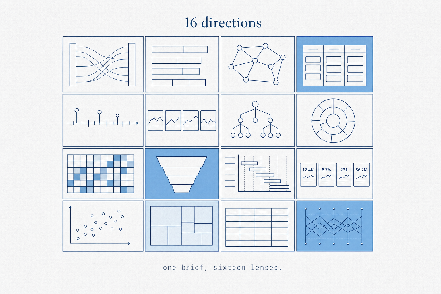
The result — 16 directions
Start with the index, then move through each direction in turn. Click Expand on any card to view the full dashboard inside the article, or Open standalone for the full viewport — the layouts are designed for the whole screen.
What broke immediately, across the set
Dense layouts that look data-rich but contain the same three data points arranged differently.
Every direction displays data. None model what the analyst actually does with it, or when, or why.
Visual registers varied widely. Interaction models did not — click, view, scroll across all sixteen.
Graph metaphors drawn correctly, but edges encode nothing. Proximity means nothing. Weight means nothing.
Conviction scores and EV/EBITDA indices looked computed. They were hand-placed. The methodology doesn’t exist.
The back half hedges. References blur. The model ran out of distinct positions before the brief ran out of slots.
| # | Direction | Register | Canvas Metaphor | Aesthetic Anchor | Link |
|---|---|---|---|---|---|
| 01 | Ledger | Institutional | Structured ledger / table-as-canvas | Capital IQ + Bloomberg | Open → |
| 02 | Atlas | Hybrid | Geographic/spatial map of theses | Stripe Dashboard + Koyfin | Open → |
| 03 | Bridge | Hybrid | Sankey: capability → thesis → target | Modern Treasury + Vercel | Open → |
| 04 | Constellation | Institutional | Force-directed graph / node-link | Palantir Foundry + Koyfin | Open → |
| 05 | Conviction | Modern SaaS | Kanban of theses by stage | Linear + Pitch | Open → |
| 06 | Heatfield | Institutional | Hex/grid adjacency map | Bloomberg Terminal + Palantir | Open → |
| 07 | Roadmap | Hybrid | Timeline: theses vs. market trends | Causal + Stripe Dashboard | Open → |
| 08 | Funnel | Hybrid | Pipeline funnel: Explore → Closed | Vercel Dashboard + Causal | Open → |
| 09 | Briefing | Modern SaaS | Document hierarchy with graph view | Notion + Height | Open → |
| 10 | Signal | Hybrid | Radial starburst: capability-rooted | Modern Treasury + Linear | Open → |
| 11 | Council | Modern SaaS | Swimlanes by strategic horizon | Height + Pitch | Open → |
| 12 | Quilt | Hybrid | Tiled/mosaic canvas overview | Obsidian graph + Whimsical | Open → |
| 13 | Treasury | Hybrid | EV/EBITDA index + financial view | Koyfin + Modern Treasury | Open → |
| 14 | Compass | Hybrid | Directional target prioritization | Causal + Kumu.io | Open → |
| 15 | Arena | Hybrid | Competitive landscape matrix | tldraw + Excalidraw | Open → |
| 16 | Loom | Hybrid | Woven/thread narrative canvas | Whimsical + Pitch | Open → |
Score summary — all 16 directions across 4 evaluation axes
- Restrained typography held throughout
- Numbers had clear visual priority
- Density felt earned, not forced
- No interaction model — clicking a row leads nowhere
- Displays data but never directs attention
- Every metric treated as equally important
The only direction where restraint was a deliberate design choice rather than a default.
- Spatial orientation was immediately readable
- Color-coded regions surfaced status at a glance
- M&A strategy doesn’t map to geography — metaphor is decorative
- Physical location encodes nothing about strategic fit
Geography is decorative here — the metaphor adds visual distinctiveness without adding analytical value.
- Sankey capability→target is conceptually correct
- Flow structure matches the underlying data model
- Static — no interaction on edges or nodes
- Flow proportions were invented, not derived
Conceptually the most correct flow model; the failure is that it never made the flow interactive.
- Node-link structure correctly expresses the graph model
- Dark institutional palette held the register
- Node proximity encodes nothing meaningful
- Edge weight is decorative — what does thickness mean?
Most visually authoritative. Lowest operational value. The gap between the two is the whole lesson.
- Stage-based kanban correctly models thesis progression
- Card anatomy was consistent across columns
- All thesis cards carry equal visual weight — no urgency signal
- Restrained aesthetic undercuts financial seriousness
Works as a lightweight tracking view; fails as a strategic decision-making surface.
- Grid density communicates coverage breadth
- Color-field signals status at a glance
- Hexagons are arbitrary — adjacency encodes nothing strategic
- Most visually convincing with the weakest operational logic
The strongest argument for why visual credibility and workflow realism are different scores.
- Correctly surfaces the temporal dimension others ignored
- Now/Next/Later labels added real structural clarity
- Assumes theses have fixed timelines — they don’t
- Gantt implies execution scheduling, not strategic monitoring
Gets the temporal dimension right; gets the M&A iteration loop entirely wrong.
- Reads cleanest of all sixteen at first glance
- Cards are discrete; columns name themselves
- Borrows from sales CRM logic, not corp dev reality
- M&A is iterative — the funnel implies one-way flow
Reads cleanest at first glance — but it is a pattern, not a product.
- Document metaphor suits analysts who write and annotate
- Sidebar navigation was genuinely navigable
- Turns active strategy into passive reading
- Document frame is excellent for storage, weak for decisions
Excellent for analysts who write and file; weak for analysts who decide and act.
- Radial layout made capability→thesis visible instantly
- Important number was isolated — genuinely hard to do
- Doesn’t scale beyond 6–8 theses before becoming unreadable
- Radial metaphor reads as decorative after first impression
The conviction index framing is right. The radial metaphor earns its place here.
- Swimlanes by horizon correctly surfaces temporal grouping
- Multi-view affordance suited the data model
- Swimlanes too wide — whitespace undermined seriousness
- Restrained palette felt underpowered for financial decisions
Technically sound. Aesthetically understated to the point of feeling unserious.
- Tiled layout communicated coverage breadth clearly
- Weakest metaphor — tiles encode no relationships
- A grid with aesthetic variation dressed up as a canvas
- The model should have stopped here
The weakest direction. Mosaic adjacency encodes nothing; this is decoration with a concept label.
- Most operationally grounded of all sixteen
- EV/EBITDA index framing was the right question to ask
- Index methodology invented — conviction score is undefined
- Tables imply precision they haven’t earned
The most operationally grounded direction in the set. Also the most data-honest.
- 2×2 correctly surfaced the conviction × urgency trade-off
- Quadrant metaphor was immediately readable by any executive
- Quadrant position was manually placed — no formula drives it
- Matrix avoids the hard problem: how do you score conviction?
The 2×2 is the correct executive framing — if the axes are real. They’re not, yet.
- Competitive map metaphor is familiar to any exec audience
- Deliberate informality undercuts the institutional register needed
- Canvas placement is editorial opinion, not data
- Signs of quality decay — commitment fading
The competitive landscape framing is the right question; the execution hedges too many references.
- Thread narrative is a genuinely novel frame for M&A strategy
- Most abstract metaphor in the set — farthest from workflow reality
- Aesthetic is mixed — registers bleeding into each other
- Evidence of model running out of committed positions
The most conceptually original. Also the least resolved. The metaphor didn’t survive the data.
Chapter 05
What it nailed
✓ Genuinely worked
- Held its declared register in every direction
- Typographic hierarchy more consistent than expected
- Did not invent charts for unavailable data
- Constraint quality drove output quality, directly
✗ Quietly faked
- Interaction model — screens display, don’t direct
- Graph hierarchy without meaningful edge semantics
- Density mistaken for sophistication
- Back-half directions hedge rather than commit
Constraint fidelity was genuinely impressive. Every direction held its declared register for all three screens. Ledger stayed institutional without hedging toward SaaS at screen two. Atlas held its geographic metaphor without collapsing into a table when the data got complex. Junior designers drift on long briefs. Claude did not.
Typographic hierarchy was more consistent than expected. Maintaining clear visual priority — most important number first, supporting data second, metadata last — is something human designers get wrong under time pressure. It also handled the data model honestly: it did not invent charts for data the spec said was unavailable. That restraint is harder than it sounds, and several directions showed genuine discipline about it.
The strongest single moment across all sixteen: Treasury (13) framed conviction as an EV/EBITDA-relative index rather than a raw score. That’s the correct mental model for the domain, and the model arrived there without being told.
The relationship between constraint quality and output quality is direct and non-negotiable. Every weakness in the output traced back to an ambiguity we hadn’t closed. The directions that held up were the ones where the brief had already answered the hard questions.
Chapter 06
What it faked
The interaction model. Every direction is a dashboard that receives attention. None of them direct attention. A real design for this use case would be opinionated about what the analyst should look at first on an earnings day versus a quiet Tuesday. On a day when three coverage targets report earnings, what changes? Nothing visible in any of the sixteen directions. The screens look different but behave identically: display everything, let the user decide. That is not a design decision — it is the absence of one, rendered in sixteen aesthetic registers.
The model also faked hierarchy inside the canvas metaphors. Constellation uses a node graph, but the nodes do not encode meaningful relationships — they encode the data schema. What does proximity mean here? What does edge weight mean? The model drew the graph without answering those questions.
Density mistaken for sophistication. Walking into sixteen directions, your eye immediately sorts by density — the terminal-register directions pull attention because they fill the frame. That is a trap. Heatfield (06) was the most visually arresting direction in the set and scored a 2/10 on workflow realism. It looked exactly like something that would appear in a Palantir product demo. It had no meaningful operational logic behind it. The directions that held up on second look were the ones with the most restraint. Funnel (08) is the one that reads cleanest at first glance — left-to-right stage progression is a pattern people already know, and the columns name themselves.
The weaker directions in the back half are not weaker because AI ran out of ideas. They are weaker because the constraint set got looser — the model hedging, mixing registers, trying to please two aesthetic masters at once. A designer would have stopped at ten.
Deep Dive
Why AI generates believable interfaces
The more useful question isn’t “what did it get wrong?” It’s: why does it look right? Understanding the mechanics behind visual plausibility separates a designer who can use these tools critically from one who gets fooled by them.
Pattern synthesis over semantic understanding
AI design tools don’t understand your product. They’ve learned, at statistical scale, which visual patterns occur together in credible interfaces — dense tables with monospace type, radial graphs with dark palettes, kanban boards with restrained SaaS aesthetics. The model synthesizes these patterns fluently. What it doesn’t do is model the operational logic underneath them. The result is interfaces that carry the aesthetic grammar of real products without the semantic content.
Learned visual priors do the heavy lifting
The reason a Bloomberg-register direction looks credible is that Bloomberg Terminal is a real, authoritative product. The visual vocabulary — function-code density, monospace everywhere, restrained color — carries authority by association. The AI has learned this association and applies it faithfully. A direction that adopts Bloomberg’s visual grammar inherits Bloomberg’s credibility signal, regardless of whether the underlying data model warrants it. This is design-token mimicry: syntactically correct, semantically empty.
Interaction hallucination
Every direction renders a screen. None of them render a workflow. When you look at Constellation — the force-directed graph — the nodes and edges look like they belong in Palantir Foundry. A senior analyst could sit in front of it and feel the familiarity. But ask what happens when you click a node. Ask what the edge thickness means. Ask what changes on an earnings day versus a quiet Tuesday. The model has no answer because it never modeled those questions. The interface is a rendering of interface aesthetics, not a solution to a problem.
The plausibility trap
The dangerous output is not the obviously bad direction — that gets rejected immediately. It’s the one that’s visually convincing but operationally shallow. That one passes the first filter, enters the shortlist, and gets built. This is the failure mode that matters.
Chapter 07
The pitfalls, stated plainly
Density is not design. Most of the sixteen directions arrange the same components differently. The model is strong at varying surface treatment — color, type, density, rhythm — and weak at varying interaction model, information architecture, or what happens after a click. The test: if you cannot describe what is different about two directions in one sentence — not how they look, but what decision they represent for the user — they are not actually different directions. By that test, at least four of the sixteen are duplicates in different visual registers.
The model decides what is important if you do not. A canvas with sixteen widgets is a list, not a design. Half of design is deciding what to leave out. “Simple” is not a constraint. “The analyst’s primary task is X; everything else is secondary and should not appear on the first screen” is a constraint.
You need a designer to read the output. Not to polish — to read. Someone who can say “this is faking hierarchy” or “the interaction model is missing” or “this graph has no semantic edges.” Claudiu caught three things in Constellation that we had entirely missed: the node proximity encoded nothing, the edge weight was decorative, and the implied interaction (click a node, see what?) was never specified. Without that critique, Constellation would have made our shortlist. It looked exactly right. It was operationally empty.
Accept quality decay after direction 10. The back half of any large-batch generation will hedge. The model has fewer distinct positions available and starts mixing registers to fill the brief. This is not a failure of the tool — it is a property of the problem. The correct response is to use the first eight to ten directions to identify the strongest thesis, then generate variations within that thesis rather than continuing to explore the full space.
Chapter 08
How to run this yourself
| Step | What to do | Why it matters | Time |
|---|---|---|---|
| 01 | Write three sentences that let a stranger picture the primary screen. | Not what the product does — what the user sees and does in one good session. | 5 min |
| 02 | Run /grill-me until every branch is closed. |
You need a named user, a primary task, real data, and at least two explicit “must not” constraints. If you don’t have those four things, the model will invent them. | 30–60 min |
| 03 | Build your reference library before generating. | Pick a register in plain English first. Then pick two concrete references maximum and state what you’re borrowing and what you’re not. Twenty minutes of setup improves every direction. | 20 min |
| 04 | Set a hard number and accept decay. | Generating eight directions finds the shape. Sixteen shows the edges. The back half is evidence, not failure. | 1 hr |
| 05 | Get a designer for the critique. | There is no substitute for someone who has shipped real products and knows the difference between hierarchy that serves a task and hierarchy that encodes a schema. | 30 min |
The AI accelerates ideation. The judgment still lives with the human — and the dangerous part isn’t that AI generates bad design. It’s that it generates believable design faster than most teams can critically evaluate it. Sixteen directions in two hours sounds like a productivity gain. It is also sixteen opportunities to mistake visual plausibility for operational validity before anyone has asked the hard questions.